Picture Framing Melbourne
PICTURE FRAMING IN MELBOURNE
Design tips from the eye of experience
Lynne and Bernie Lowenstein (co owners) have been helping customers make their homes more beautiful since Print Decor was founded in 1985. Following is a collection of picture framing design knowledge garnered since we first started designing picture framing back in 1985. Having worked with some of Melbourne's top interior designers we pass on not only our personal knowledge but that gleaned from the best in the design industry.
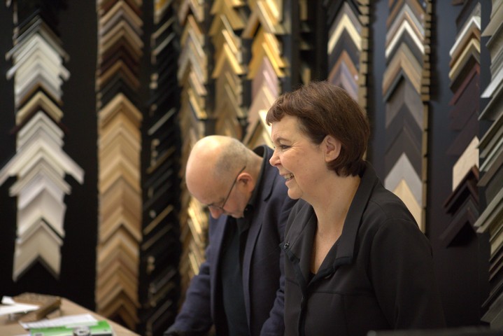
Lynne has started compiling a series of framing design advice and tips and where possible we have added photos.
The great artist Manet once said "without the frame my art is nothing".
Please note we are better framers than we are photographers!!
The framing advice that transcends all others is-
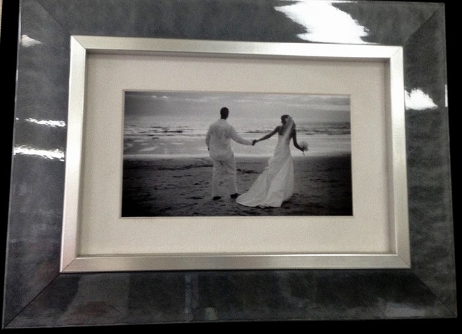
Design Tip #0. NOTHING is more important than the wedding photos...(well not until the baby arrives).
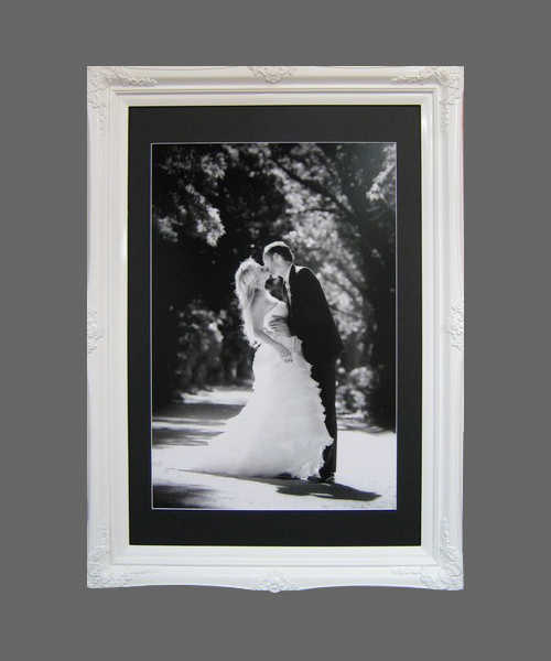
The above gloss white ornate Princess frame helps enhance the beautiful black and white wedding photo.
Care was taken to use acid free backing and matting to help preserve this precious photo. Such factors as the backing board and mat board (carboard) surrounds should be of the highest quality acid free archival materials. If the picture will be subjected to strong light the UV rays can cause damage if the correct glass or Plexiglass (perspex) is not used. Photos can be carefully glued down to prevent ripple but a special inert glue should be used.
Design Tip #1. Choose the frame that “sings” for your artwork as the most important aspect when choosing a frame. Believe it or not artwork of all types has personality and the right frame will bring out the best in the artwork.
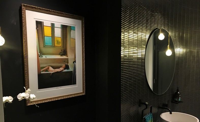
We framed this beautiful Limited Edition print with a traditional ornate frame. The frame suits the period bathroom in the image, and nudes are timeless. It shows how you can add older styled charm to a contemporary environment.
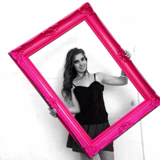
2. Well... Pink Ornate may not be everyone's taste, but we thought our daughter and the Pink frame were just too cute to omit. We can convert any frame to any colour.
Originally this frame was a very traditional Gold...we couldn't resist modernising it!!
Custom Framing Discount Card
By filling out the VIP subscriber form (click here) you will receive the occasional email with special custom framing discount offers, new releases, and info about new local artists.
3. The colours selected in the mating (cardboard surround) and frame should harmonize with the work being framed. Much like a good musical piece there is a certain harmony in the visual aesthetic. This doesn’t mean that every design has to be passive or meek, punk rock and rap done well has an aesthetic appeal to the appropriate audience too.
Check out these "punk rappers".
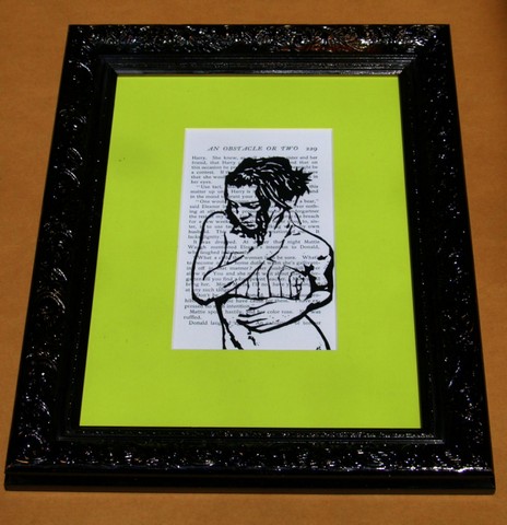
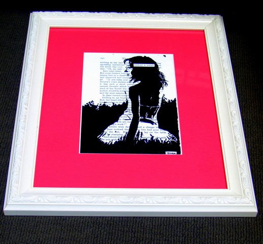
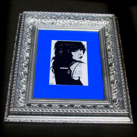
4. The most common choice of top mat (cardboard border) is a neutral colour. Today’s fashion favours white. We have around 30 shades of white at Print Décor to choose from, to best suit your artwork.
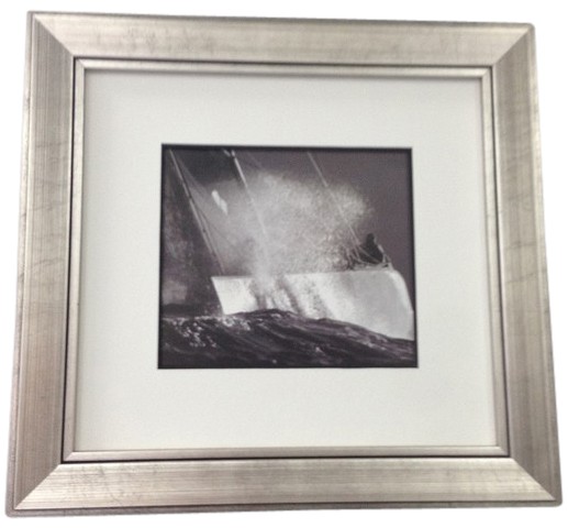
5. When choosing white, the mats will usually not match the white (of the art work or photo) exactly so it is best to choose a slightly darker white so the artwork stands out more.
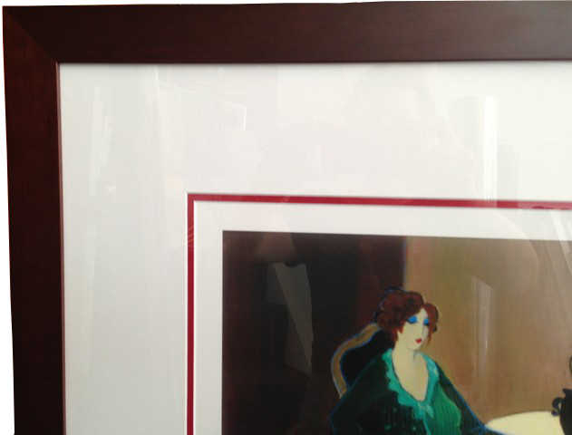
6. Bring a photo of your décor. Our designers can then take your colours into account when designing the frame.
7. Work with your own style. Your home should reflect you, and a framed artwork is part of your décor’s style. Our designers can suggest designs that complement the artwork and your style.
The information below can help you become informed and be involved in the creative process of choosing the perfect frame for your artworks and photos.
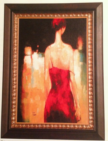
Vs
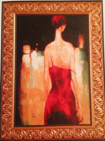
Which is the correct design?
Answer... read on...
Well here are 2 basic design rules-
1. There are no rules.
Different artworks require different designs. Each artwork is unique! To help design a frame...let the artwork talk to you about its colours, textures, content, style, message. This applies also to prints of artworks and photos.
Be creative and try different styles of frames, a brave colour or a soft gelato pastel. A rough textured wooden frame or a sleek shiny industrial look. One of them may look extraordinary. We will work with you and your ideas!
2. There isn't one correct design.
I often say to people when they bring their artwork in, that I will keep making suggestions until we find the one that resonates both for the artwork and your unique taste.
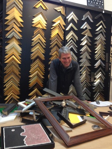
This can sometimes involve mountains of frames and matt boards piled up on the design bench, but we always reach the style of framing that works for you.
One thing we would never do though is let you make the wrong framing decision!!
Lynne is compiling a list of 99 framing and design tips, if you would like to receive updates please subscribe to our e-mail list above left (or click here >>>)
So which design is correct?
Answer, which one works for you? Perhaps neither, you may prefer a modern white on white frame and this would again make the above artwork look different.
All three designs would be correct.
8. Framing should enhance the artwork and not compete with it. So that would mean picking a neutral frame that doesn't overwhelm the framed picture....like this-
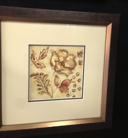
or possibly this-
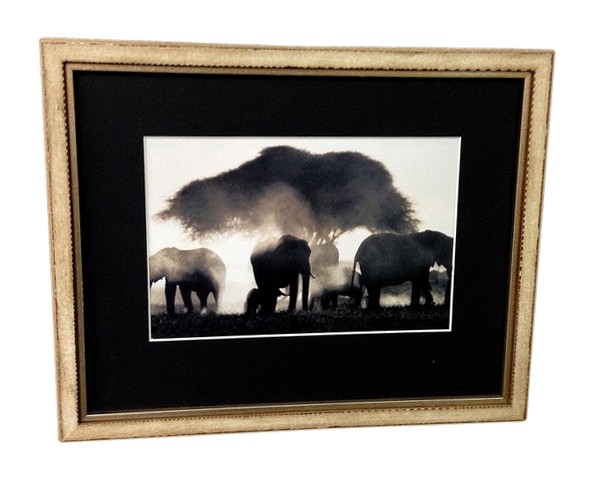
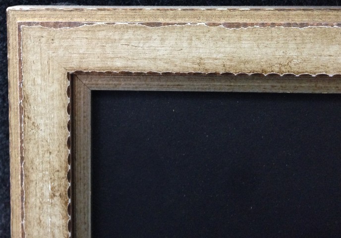
Above. A simple but reasonably sophisticated frame.
In the close up detail you can see the frame has been made to look aged yet its geometric shape still gives it a contemporary edge. The white wash aged finish is in keeping with current interior design trends.
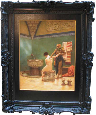
9. But a neutral unassuming frame is not always the case. In some instances you can augment the work of art by using a frame compatible with the look of the picture.
Below are 4 small post cards framed in relatively large ornate frames.
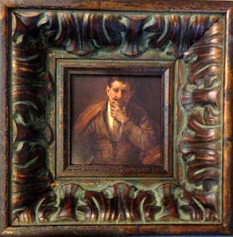
The above frame is from our Bellini range.
Click / tap here to see a YouTube clip about frame making at its best >>>
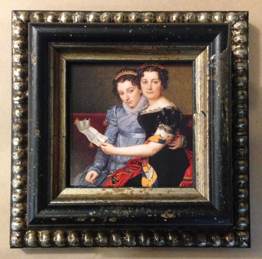
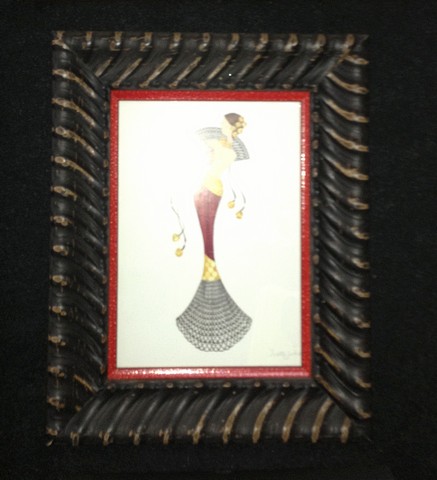
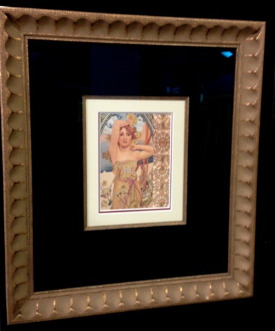
10. Size of the actual frame (mouldings) are important. "The larger the image the larger the frame" is not always the correct answer. The thickness of the frame has a bearing on the physical strength of the frame, so yes a huge art work or mirror would need a more sturdy frame particularly if requiring glass. However a small painting can look pretty impressive with a big chunky frame.
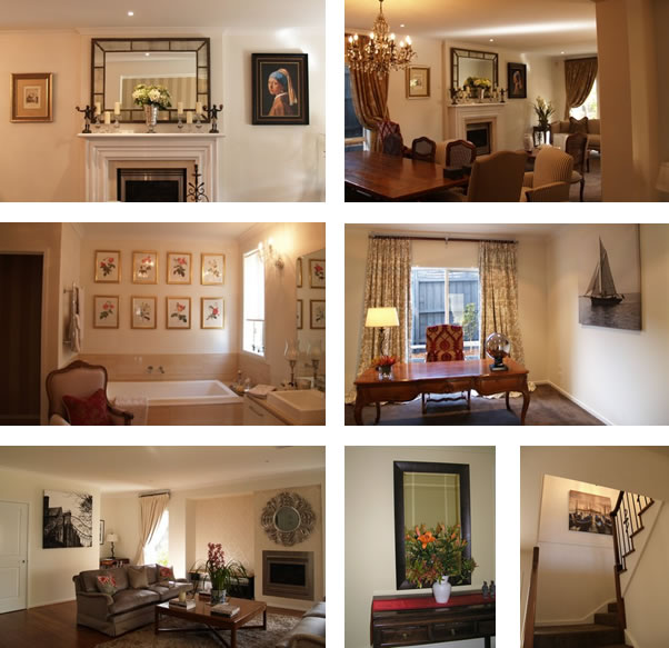
11. Bring a photo of your décor. Our designers can then take your colours into account when designing the frame.
What is the importance of custom framing?
Custom framing and your artwork turn four walls and furniture into YOUR home.
Have you ever entered a room and felt it was a little cold? Part of that problem can be the absence of beautifully framed artwork. Lack of framed artwork, or even cheap uninspired framing can bring the tone of the room down. Artwork is hung at eye level, so it is what creates the impact in a room. It adds the aesthetics.
12. Work with your own style. Your home should reflect you, and a framed artwork is part of your décor’s style. Our designers can suggest designs that complement the artwork and your style.
13A. Bling can sing! Don't fear the gilt frame, gold is making a come back. It universally is the most selected frame finish over the years because it literally can not colour clash. Today we are fotunate in being able to provide more contemporary frame shapes to a traditional finish.
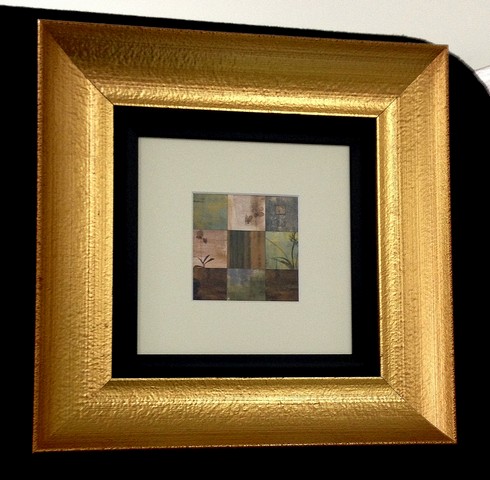
13B. Decide whether you would like to frame for the artwork only or whether you can work it into your home.
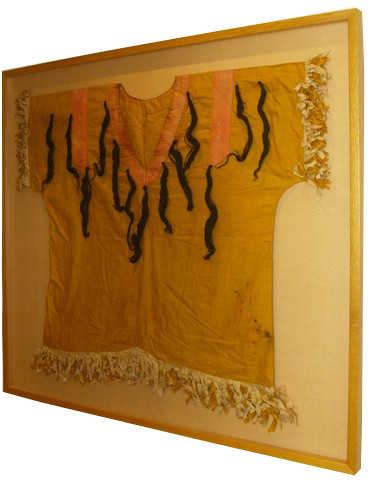
14. Framing can preserve valuable items such as baby clothes, boots, medals, and even wedding dresses. They can be framed aesthetically and put on display to enjoy rather than have them carefully stored away.
15. Think about how important colour is to you and your favourite colours.
16. Often the artwork brought in by you has your favourite colours. We help make the artwork work with your preferences.
17. You can bring in a swatch or photo of your room to help with the design.
18. By adding white to the colour you make a tint.
19. There are vivid and dull colours which are seldom combined in matt boards. One major reason for this is that artists seldom combine them on their canvases.
20. Dark and light colours are often used as a framing combination with the matt boards.
21. Neutral colours are passive, easy to use and most people accept them.
22. Complimentary colours such as Purple/ Yellow. Green/Red, Blue/Orange, Blue/Yellow, Purple/Green when positioned next to each other tend to stimulate, excite and attract attention.
With the below framing of religious icons we selected strong colours that picked up the colour tones in the pictures.
This created a rich powerful feel and conveyed due importance to the subject matter.

23. Colour changes dramatically on different backgrounds depending if it is light or dark. It is also affected by its surroundings. You can change the visual perception of a colour by surrounding it with a different colour.
![]()
In framing this religious icon we picked some of the key colours and stacked four mat boarders on top of the existing white and green.
![]()
Aside from the rendering of importance to the icon is the fact that the glass is raised above the image as each boarder is approx 3 mm deep, creating a 12 mm depth which gives the effect of peering through a window at the icon. This can even be further exaggerated by placing a hidden spacer between each mat.
![]()
Another factor to consider is how much of each colour should be shown. As a general rule a very strong, bright colour (such as the orange) is best held at 2 or 3 mm so that it accentuates without becoming overbearing.
24. Read works by Joseph Albers on colour design.
25. When framing family photos look at colour and select the shades and tints. Different photos have a slight hue that you can develop.
26. Don't overwhelm the picture with the framing design.
27. When framing an Oriental piece of art you can narrow the sides and elongate the top and bottom with the matting to create a scroll like effect. The sides should be one third or even one fourth of the width.
28. Matt with equal top and sides is most popular and slightly weighted (wider) on the bottom, particularly with landscape (horizontal) format.
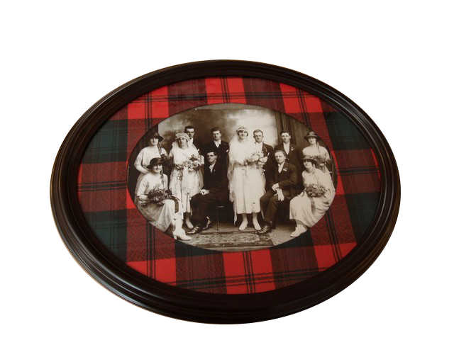
29. Ovals are elegant and graceful. Too many ovals however can look like a target. To balance an oval use ovals in rectangles.
30. Oval and circles with matting are especially suited to artwork which is focused in the centre such as vignettes and portraits.
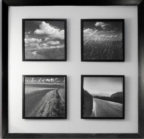
31. When framing multiple items in a mat, pay attention to balance.
Group items and then work out outside mat border size.
32. Colour is usually the first reason people select a frame and / or mat board.
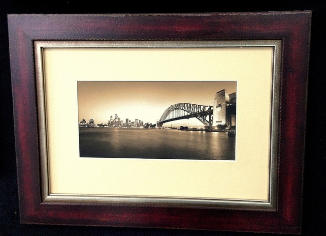
33. By extending the background with matting you place the piece in its own environment.
34. Size of matting. Don't come in too close to the picture. Small needs more matting to make the piece comfortable.
35. Small mats create too many lines. A small piece needs larger mats.
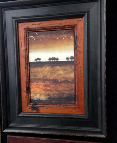
36. You can use a wide frame on a small painting to give a modern look.
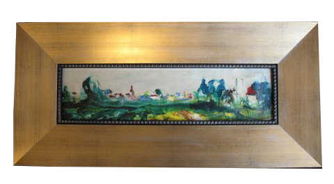
37. Framing needlework. Should never touch the glass.
38. Fabric matt boards add richness and texture to framing.
39. If you frame three pictures with different sizes, the top borders stay the same, with variations on sides and bottoms.
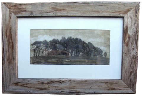
40. Be mindful of the era and style of the picture and parallel this in the framing design.
41. Don't fear "going over the top." The Van Gogh below could hang quite comfortably even in a contemporary setting. Framing a masterpiece like a masterpiece completes the vision.
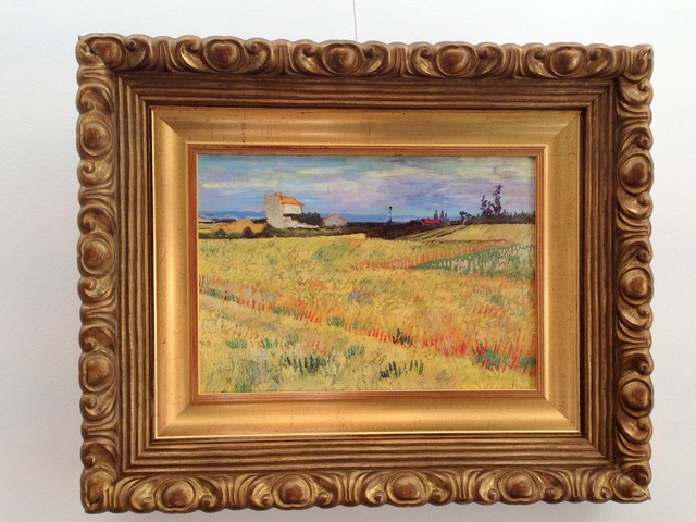
In the Van Gogh print above we have boldly gone where we should have gone and done this beautiful reproduction justice. First we had an artist apply a hand finished brush stroke to the print thus transforming it from a mere print to a piece that replicates the original. The framing does the painting justice.
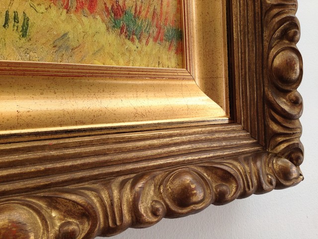
The inner hand finished Italian gilt frame has been used instead of a cardboard mat thus preserving the style of the era. The outer frame is one of our beautiful Italian Bellini frames. A work of art itself. Note the red brown base (bole) beneath the burnished gold leaf. It compliments the red brown hues in the painting.
Click / tap here to see a YouTube clip about frame making at its best >>>
42. "Red and Orange should never be seen unless there's something in between" actually the jingle used the colours Blue and Green- either way similar colours particularly strong "popping" colours provide a challenge when laid beside each other. The combination of red, orange and indeed pink is seen more often in Eastern cultures. The below religious icon of Ganesh was brought in to Print Decor to be framed. I had to take a phone call and I offered for the customer to pick some colours he would like to use...
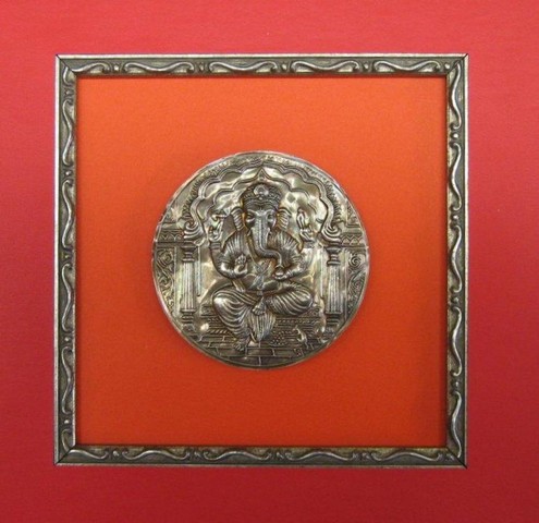
"OMG" I thought when he picked the 2 brightest colours in the sampler.
When we laid it out and placed a silver "fillet" between the 2 colours it worked beautifully. The petit but ornate frame gave this loved Hindu God justice.
43. You can just tell when "red is off", you don't really need to know about colour base or tints or hues. Just look at it and if it looks right it IS right. Of course the more you work with 'keying' colour the easier it gets. We think this little bird is happy in the framing we designed for her. One of the tricks of our trade is to break the colour with a neutral colour between the two key colours. In this case we used an antique gold mat between the red mat border and the red in the image. The gold also compliments the frame and brings an overall harmony to the complete work.

44. The way to tell if good quality mat boards have been used in framing is to look at the edge where the board has been cut. It is usually cut on a 45 degree bevel exposing the inner core. (see the inner LHS and bottom of the mats in the above framed image). A good quality low acidic board will remain crisp and white for many years whereas a cheap mat board will start to discolour and go brown within 1 to 3 years. This discolouration will eventually burn its way into your picture, and should be replaced.
45. Synergy "the interaction or cooperation of two or more organizations, substances, or other agents to produce a combined effect greater than the sum of their separate effects." (Dictionary.com)
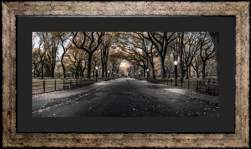
A beautiful photograph by Nick Psomiadis of Central Park New York.
With the perfect frame for this image we have an aesthetic collaboration greater than the individual components.
46. The hidden factors of framing can be the most important.
A simple frame with latent style...with some hidden features.
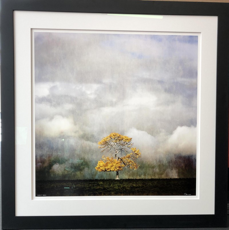
We helped one of our customers with this simple black frame and white mat (cardboard boarder). The "hidden features" include a raised up mat-if you look on the left hand side you'll see a shadow which is caused by the elevated mat. This gives a subtle 3D effect without introducing extra colour. The other factors you won't see but in 20 years time they would become obvious if not included. Instead of "normal" glass or "non reflective glass" which helps eliminate glare but creates a fuzzing effect of the image we chose a new product-UV Blocking Art Glass. This provides a glare free view of the image and block harmful UV light from fading and eventually destroying the image. Other framing features include acid free backing and mat which stop that horrible browning that would appear some years down the track.
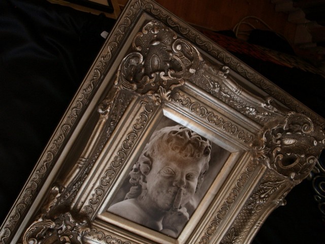
I wonder who Michelangelo's framer was?
Lynne continues to add framing advice. If you would like to receive periodic updates and a "heads-up" when there's a special offer please subscribe to our mailing list click here >>>
Need to know more? Have a read of some of the Print Decor published articles and Blogs >>>
